Owego Donut and Beer
How MediaBrush helped an up-and-coming restaurant build their brand from scratch.
From Idea to Local Icon in Under a Year
The Challenge
When Owego Donut and Beer first approached us, they didn’t have an official name, a logo, a website—or even a single customer. What they did have was a bold idea: create an unexpected culinary experience that paired scratch-made donuts with craft beer in a historic upstate New York town.
They needed help turning their vision into a brand that would not only attract locals but build a loyal following—and they needed it fast.
The Solution
We partnered with Owego Donut and Beer from the ground up, building a strategic brand identity that matched their quirky, high-quality concept and positioned them to dominate local search and social attention.
Here’s what we brought to the table:
-
Logo & Brand Design – A visual identity that captured their bold, playful spirit while staying modern and clean
-
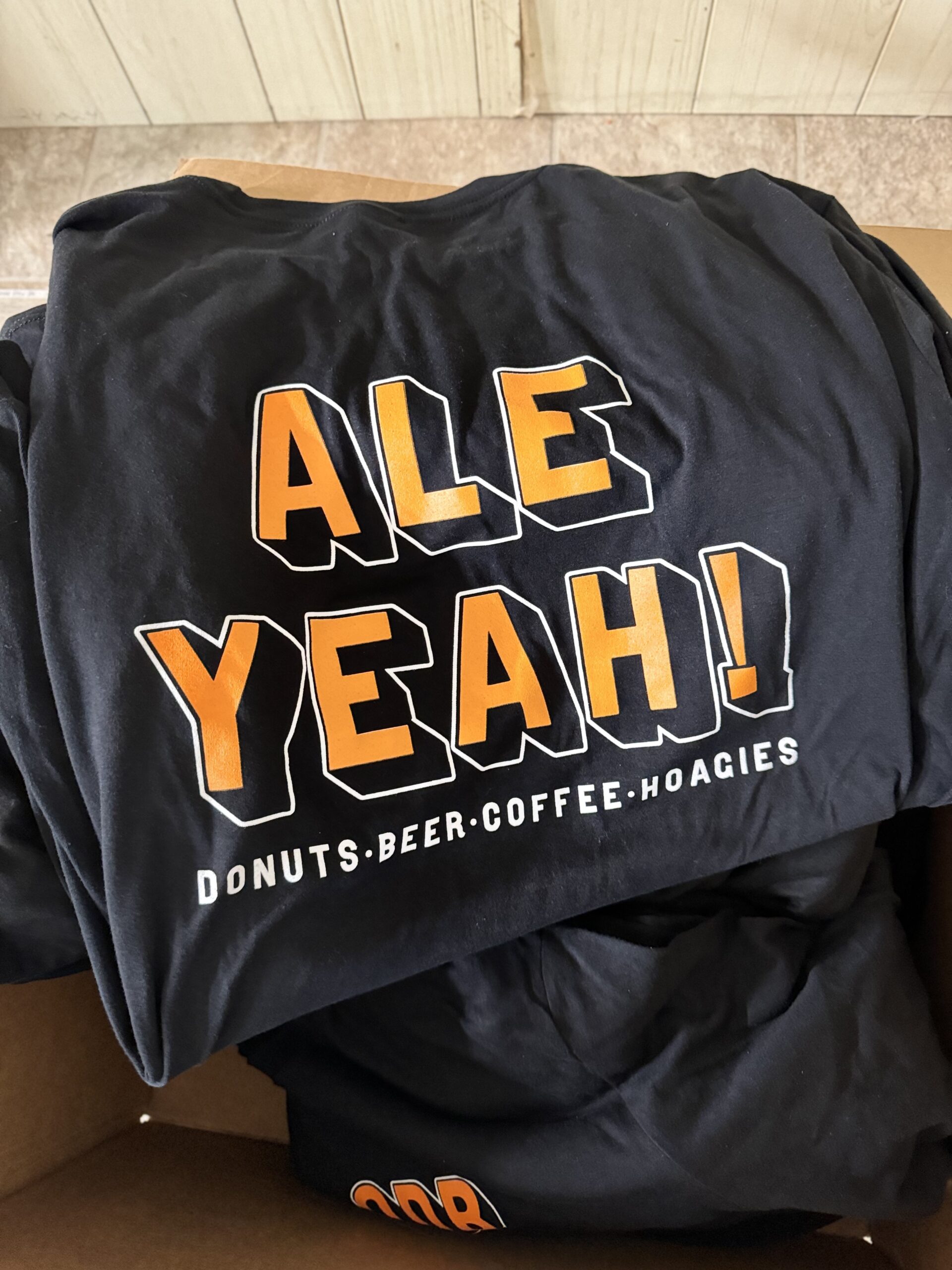
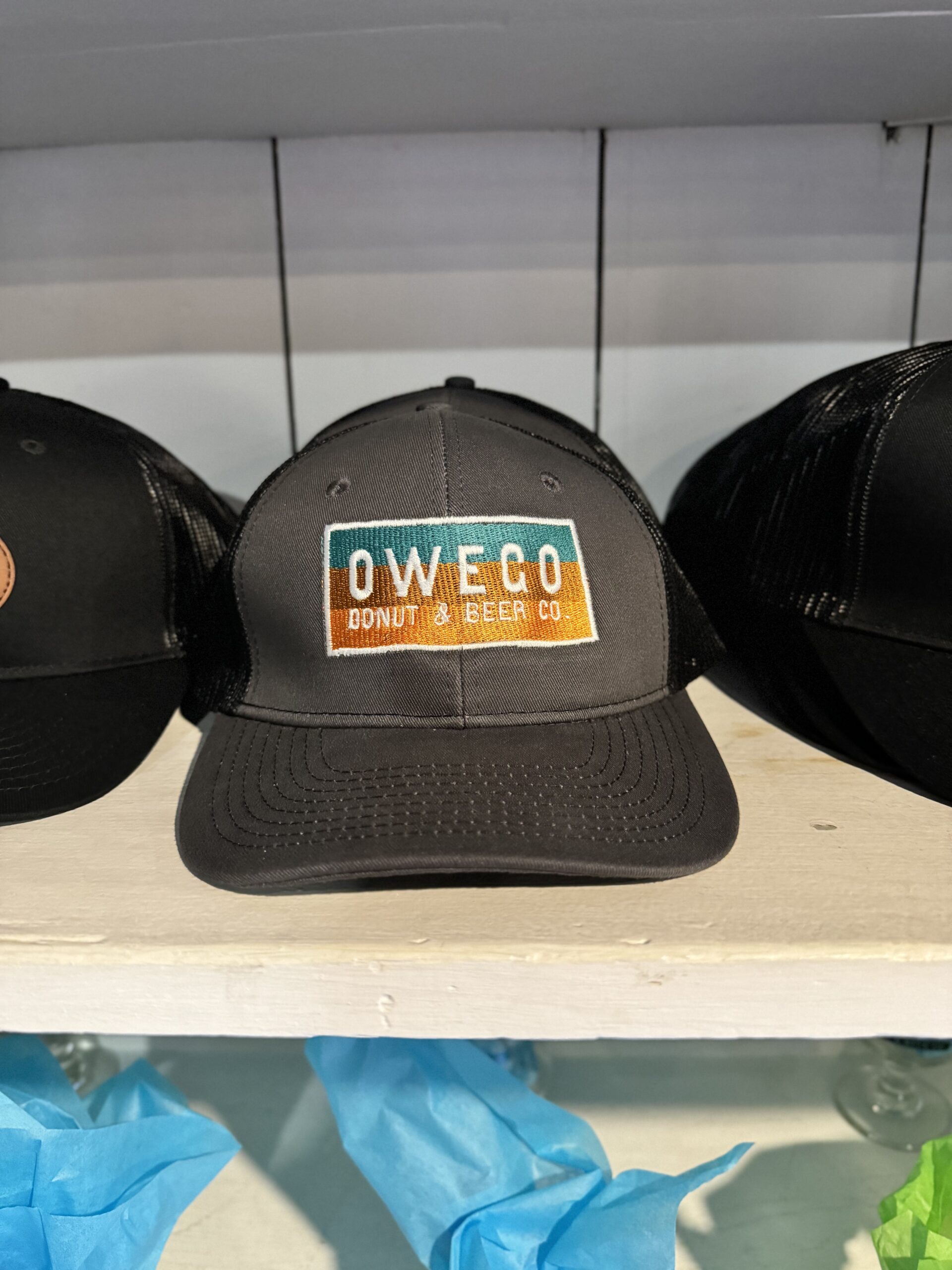
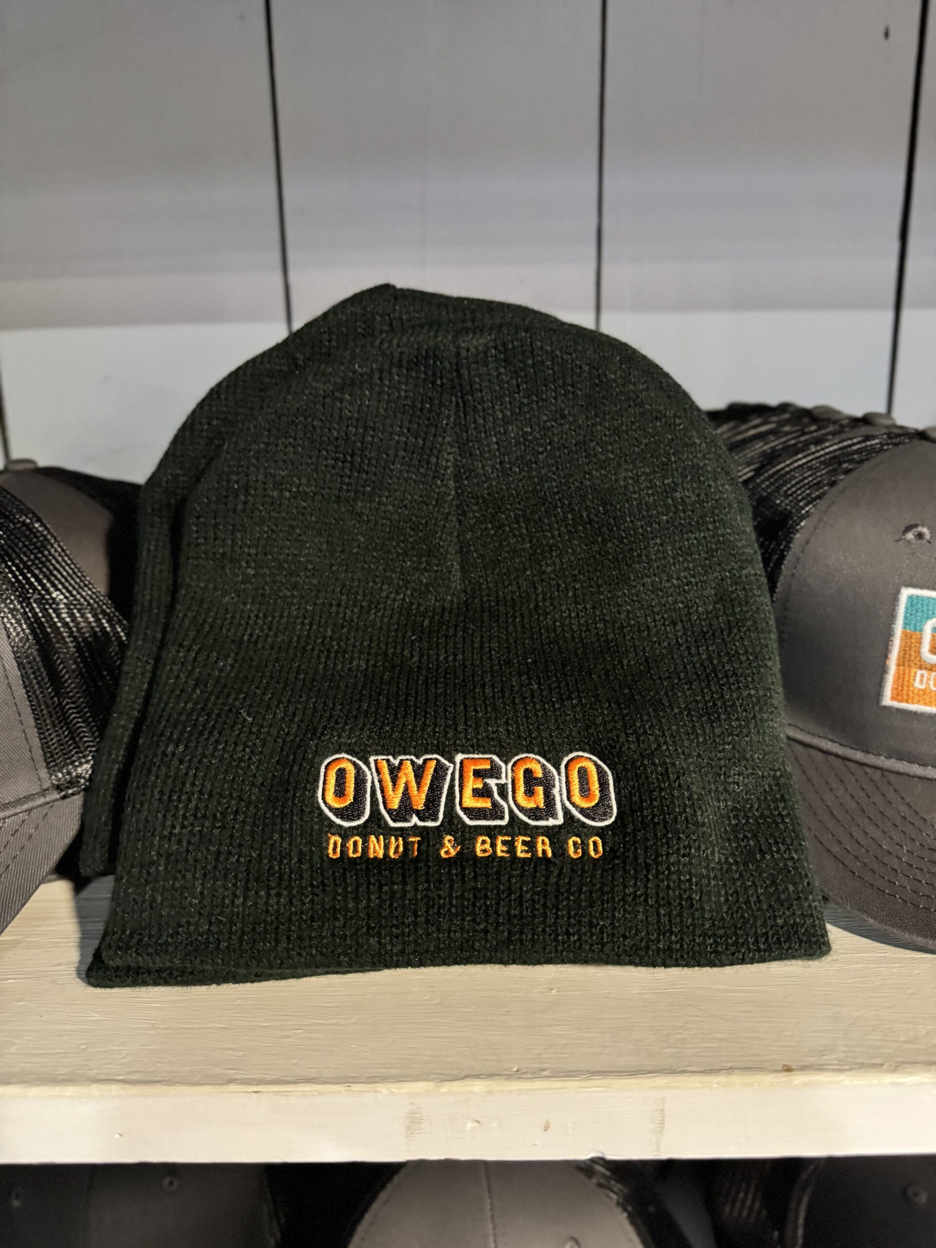
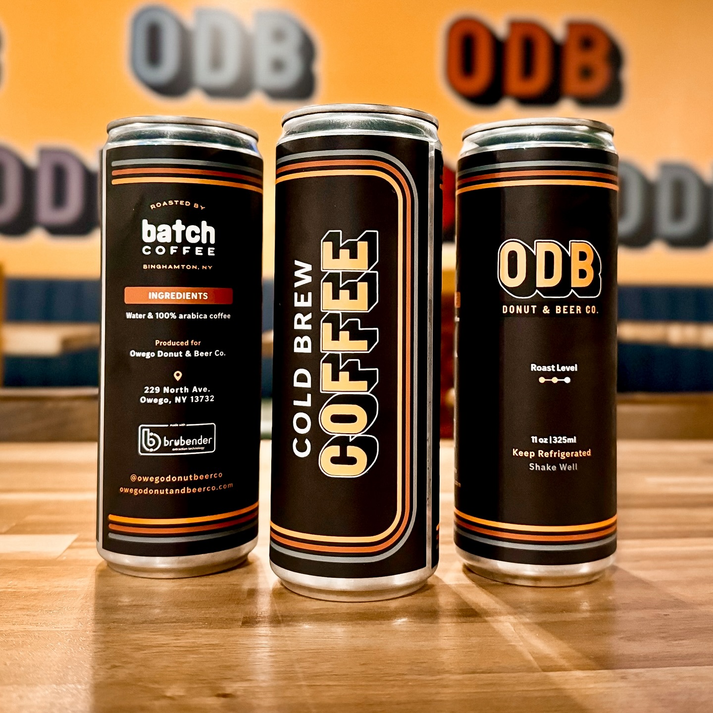
Packaging Design – Custom donut boxes, beer labels, and merch designs that extended the brand beyond the storefront
-
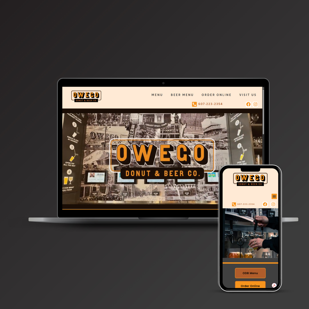
Website Development – A mobile-first, SEO-optimized site that showcased their offerings, promoted events, and integrated seamlessly with ordering tools
-
Google Listings & SEO Strategy – Complete setup and optimization of business listings with a focus on geo-targeted search
-
Email Marketing – Ongoing strategy and design of branded blasts announcing new flavors, seasonal promos, and local partnerships
Every piece of the strategy was custom-built to help them stand out, connect with the community, and grow fast.
Outcomes
- A distinctive identity that stands out in the market
- A cohesive in-store experience designed for customer engagement and social sharing
- Merch that reinforced the brand''s quirky flair while engaging all guests-from dads to lads
- Strong community alignment that celebrates Owego’s character while introducing a modern twist
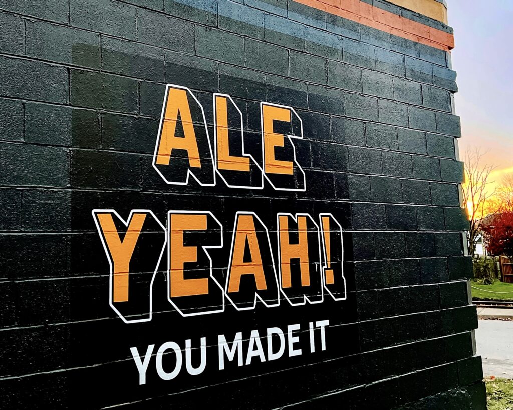
Building A Playful Identity
Our team began with an in-depth brand exploration, leaning into the memorable, easy-to-say acronym ODB. Its nostalgic nod to classic hip-hop added a fun undercurrent without defining the brand outright. ODB carried rhythm and personality, which served as an anchor we could build a signature identity around.
Bringing The Concept to Life
We developed a color palette inspired by classic primary tones shifted slightly off-center from a traditional primary color palette for a richer, more modern feel. We used warm golds, deep blues, and a burgundy red that were all grounded in a soft gray to keep a vibrant and welcoming feel.